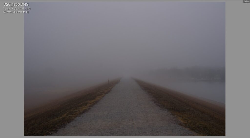
Here we are, the final photo in my series of images shot at Holmes Lake in Lincoln, Nebraska, when my family and I spent a few days visiting friends and family back in our old stomping grounds. We spent about an hour and a half circumnavigating the lake on a crushed limestone path with my brother, his wife, and their two friendly, furry Huskies named Tank and Radley. At this point we were almost done with the walk, and though I had taken several shots that tried to capture the scene in a way that emphasized the oppressive, haunting nature of the fog, and how different the entire experience was from anything I had come across in my life, I don’t think I quite nailed what I was going for.
And then, as we rounded a bend in the path, we were presented with the scene you see here. I had my Nikon D750 and 50mm f/1.8 lens, the same one I purchased well over a decade ago, the lens that ignited my passion for photography, and thought that if any visual representation could convey what were seeing to someone who was not present (i.e. most of you looking at today’s image online) it would be this: a small cluster of benches among bare trees thrust out into the lake on a thin peninsula, with a distant shoreline shrouded in mist.
I dialed in an aperture of f/4, with auto-ISO choosing a shutter of 1/180 and ISO 200, focused on the tree farthest out on the breakwater, and took the shot you see here. Other than some minimal adjustments in Lightroom (shadows, highlights, etc.) what you see is exactly as it was in the moment. As I took a few more shots just for good measure, I noticed one tiny bit of movement that didn’t catch my initially, but whose presence initially…well…kind of bothered me: the headlights. The car was ever so slowly, but also quite safely, creeping down the road on the other side of the lake and I was impatiently hoping it would move along already so it wouldn’t ruin the shot. It finally did, at which point I was able to finally get some photos without it.
However, the more I looked at my images in Lightroom, the more I ended up appreciating, and finally embracing, the pair of vehicle lights far in the distance. They added a spark of brightness (two, to be precise) to an otherwise entirely dully, gray composition and also created a sense of restless foreboding not unlike the palpable unease that permeates Stanley Kubrick’s The Shining. I also like that the headlights are not immediately obvious, especially when viewed on a small screen like a mobile phone, but add an additional layer of the scene to take in and explore upon deeper inspection.
Finally, frequent reader might be familiar with how much I go on and on about the concept of context. That is, something within the frame to give the viewer a sense of time, place, or scale that they can latch on to and connect to the rest of the image. Or even themselves. Those headlights, I came to realize, served to add much-needed context to the image that elevates it above the rest that I took where the lights were simply not present. They give you, the viewer, an idea of how far away the shore is and the downward angle of the lights indicates a road winding up and down among the contours of the hillside. I was thoroughly, and quite pleasantly, surprised at how much those headlights added to the image and remain incredibly grateful to the nameless driver who had no idea how much they were contributing to the photo.
This was a fun way to cap off the walk, and a unique photography experience I likely will not soon forget–or be able to repeat. Thank you for coming along this journey with me, and don’t worry…if you’re tired of gray foggy photos, next week should be a familiar return to form.


