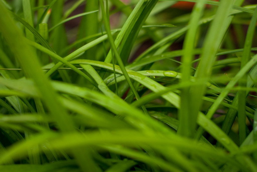
I realize this picture is quite similar to one I posted a long time ago, but I’m using it for this week’s image specifically to make a point about my thought process when deciding which pictures to upload to my online Flickr portfolio and then feature here on Weekly Fifty (not all of which make the cut). It’s sort of a case study analysis, so to speak, partially to illustrate how my approach to photography has changed over the years but also to help others who might be wondering how to change their approach to photography too.
What you see above is relatively simple: a drop of water in a patch of grass. There’s a very monochromatic black-and-green color palette and not a lot of things going on, but I want you to compare it to a similar picture I took in the same location a few minutes later:
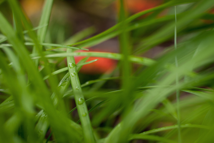
The two images are remarkably similar, and the second one was originally going to be the subject of this week’s blog post. But after a little thought and analysis I settled on the first one and I thought I’d take a minute to explain why.
One of the things I like to keep in mind when photographing is the question “What do I want the viewer to see/think/feel?” In this case I was not trying to impart any special message or feeling, but rather have the viewer notice a simple drop of water on a blade of grass. Even though both images do that, the second one has a bit too much going on and actually becomes a bit of a mess. The focal point of the second image is the drop on the top of the blade of grass, and once you see that you might notice other things as well: additional drops of water, the surrounding blades of grass, or the (blurry) red flower in the background. This was good, I thought, because it gave the image more depth: it’s actually a lot more than water on grass, and that’s a good thing.
Right?
Not really. The more I looked at the picture the more I realized there was actually no focal point and instead there was a confusing mess. What was it I was trying to get my viewers to see? Was it a single drop of water, or many drops of water? The red blob in the background became distracting, and the foreground elements (some of which are on the left, some on the right) divided the viewer’s attention. Instead of being about one clear thing the photo was about many unclear things.
Even though the picture on top had less color and less going on it was actually far more pleasing to the eye and, in my view, more interesting overall. There is one clear focal point: the single drop of water. That gives the viewer something much more concrete and tangible on which to focus his or her attention, and a more pleasing sense of place and context as well. The foreground is not as cluttered and there is nothing in the background to divert the viewer’s attention. It’s simpler but, in my opinion, a much better image.
Rebecca Burlingham says
I agree with your choice, the top photo being the feature rather than the busier photo. I might have taken it further and gotten closer to the water droplet. You could have changed the angle of the shot and created more blur in the foreground and background. I may have also placed the drop a bit lower and to the right.
Great topic to make me think about how I compose shots.
Simon says
I like your idea of focusing closer, Rebecca. Unfortunately the minimum focusing distance on my 50mm lens is about 1.5 feet which means this was about as close as I could get. I sure would like to get my hands on a nice macro lens that would let me get right next to tiny subjects like this drop of water though! Maybe someday… :)