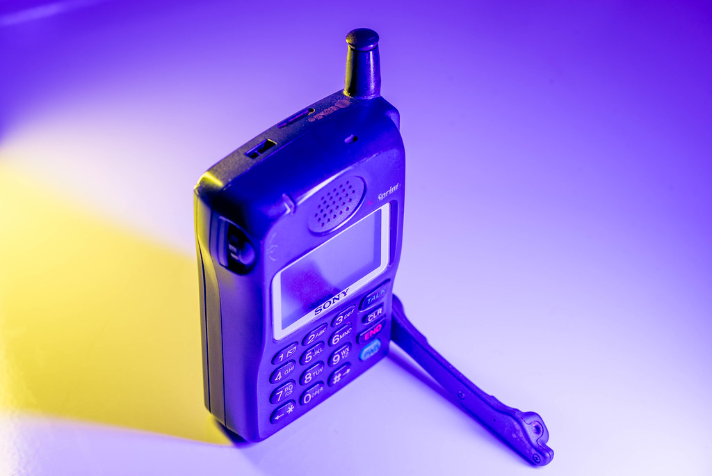
I’m not the kind of person who hangs on to a lot of physical objects. Digital clutter is fine, because it’s easily searchable and doesn’t take up much space in my house, but physical clutter is another thing entirely. It’s not that I throw away everything from earlier in my life, but I (along with my wife) try to be selective about what we choose to keep around and what to toss. This old cell phone is, for some odd reason, one of those things that has been sitting in various drawers, boxes, and bins over the years but, much like Bob Wiley, has never actually left. It doesn’t charge and wouldn’t work if it did, since the cellular network it used has long since been shut down, but it’s still a fun relic to keep around and show my kids.
I’m getting a bit ahead of myself here; a bit of context is probably needed in order to better understand this week’s picture.
The cell phone you’re looking at is the first cell phone I ever got. I think I received it as a Christmas gift in maybe 1999 or 2000, as an upgrade to the pager I used to wear around my belt loop. (A pager! Man, kids today will never know…) It couldn’t do much other than make calls and the battery died if the conversation lasted more than 20 minutes, but the flip-out antenna was super cool and it was small enough to fit in my pocket–a big deal for phones back in those days. This phone now sits on my office shelf at work, a reminder of my digital roots, so to speak, and though it serves no practical purpose I do think it’s fun to pick up and show people.
So when I got my Nanlite Pavotubes I naturally thought this old phone would be a fun photography subject. And while I don’t think I was wrong, I will say that there are some definite areas of improvement here. As I have said time and time again, photography for me is all about the learning process and I can most certainly see that process at work in this photo.
For starters, the black phone appears to have a kind of blue/cyan tint to it, which is a direct result of the color of light I was using on the right-hand side of the composition. Whereas last week’s shot of a Super Nintendo controller used light and shadow to accentuate the buttons and contours, the blue light here doesn’t really do much other than to cast a visible pall over the phone. It’s not great, and I think a more neutral light would have worked better. I also used a yellow light behind the phone to add some highlights but again, it seemed better in theory than in practice.
If last week’s shot was me gleefully exploring the possibilities of colored off-camera lighting, this week’s picture is a reminder that I also need to reign it in a bit: plan my shots, consider my subject, think about what the purpose of the lighting is…but also experiment and have fun because it’s all part of the learning process :)
Leave a Reply