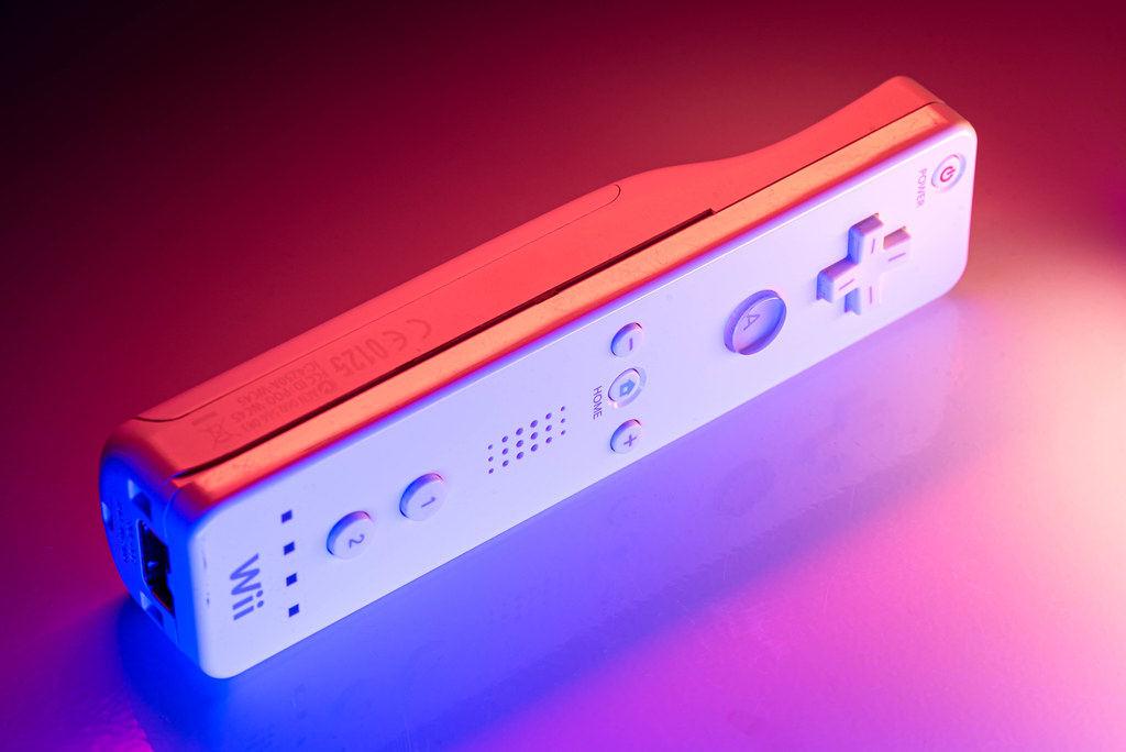
Once again, another shot of a fairly simple object enhanced by the presence of some colored lights. This is clearly becoming a pattern for me, and I’m having so much fun experimenting with the new possibilities afforded by my new Pavotubes (Note: I get no commission or anything from B&H, I’m just linking in case anyone is curious what these are and where I got mine.) Thanks for hanging in there with me, readers, because right now I don’t know that I’ll be stopping any time soon. Then again, who knows…maybe this will be the last one of these kinds of shots for a while because I’ll move on to something else. I dunno. As my dad said when I was a kid, and still quips to this day, we’ll have to see once.
This image bears a striking resemblance to my earlier picture of a SNES controller, but there’s some subtle, but very important, differences that showcase what I have been learning about the use of off-camera lighting to create these pics. First, and most importantly, I increased my number of lights by 50% over the SNES controller. While the original was lit with two Pavotubes, I have since acquired a third and my goodness, what a difference is is making. I experimented with several lighting ideas when setting up this picture and eventually settled on the following:
Light A: Set to 2700K placed horizontally just to the right of the frame.
Light B: Set to blue (I forget the exact HSL value) placed horizontally just to the left of the frame.
Light C: Set to orange (again, I forget the exact color scheme) which I held in my hand above the controller.
As in previous shots, the subject was resting on top of our washing machine partly to get a cool reflection but also because the laundry room gets super dark when all the doors are closed, which is great when you want to control the lighting.
I decided to take a bit of a different approach when lighting this controller compared to the others. First, I used Light A for the face of the controller because I wanted it to look, more or less, like a normal Wii remote. I tried using Light B and C for the face, but what I realized is that the colored lights worked best for accents, not the main light. When I lit the front so as to be orange, purple, etc., it just didn’t look right at all.
I also was very intentional about using Light C for a specific effect: the bright highlight running from top-right to bottom-left on the smooth surface of the controller. I held Light C in my hand and waved it around like a magic wand until I found just the right position to make that surface shine, and it ended up giving the whole composition a bright, punchy, almost three-dimensional feel.
Beyond that about the only editing I did in Lightroom was the removal of spots, dust, and scratches. No cropping, no major color changes, and certainly no fundamental altering of the image. What you’re seeing here isn’t the result of CGI trickery or advanced photoshopping, just lights, my camera, and a washing machine :)
Leave a Reply