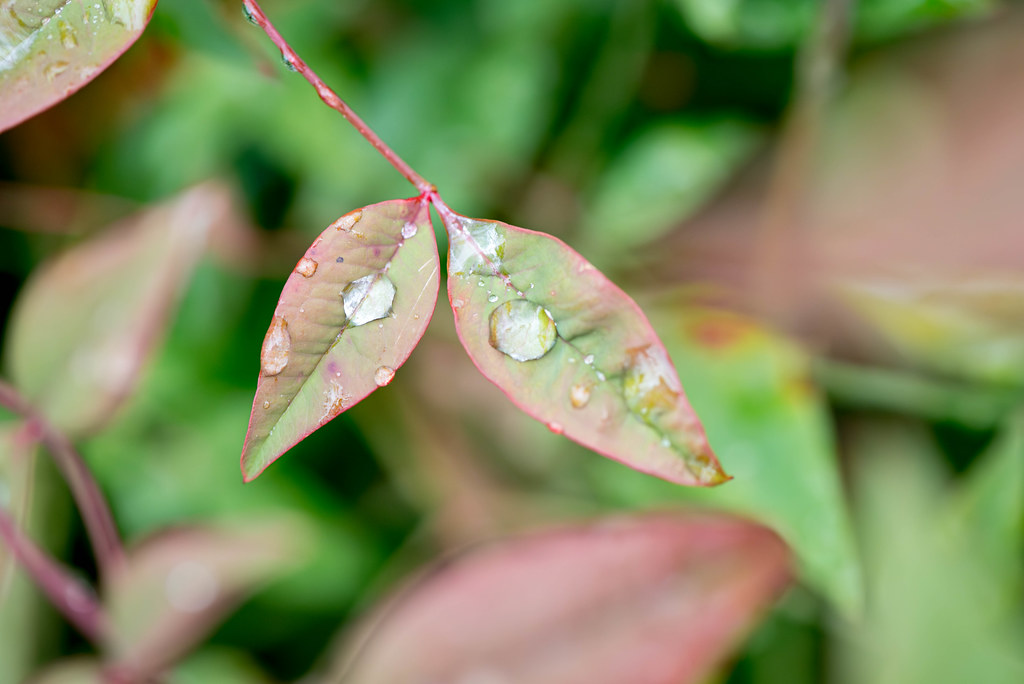
Lately I have found myself revisiting earlier compositions in an effort to see if I can build on the originals, revisit them in some kind of creative way, or just to see if I have learned anything since taking them. This shot is kind of like that in some ways, though not as far-reaching as some of my other photos like the mockingbird I shared two few weeks ago. Back in October I took a picture of a drop of water sitting at the intersection of three leaves, and while there were a lot of things I liked about it I didn’t appreciate how busy the entire image was. The drop in the center drew your eye right away, but then the rest of the frame was kind of a confusing mess of light and dark greens. Not that it was a bad picture, just that it left some room for improvement. This week’s image, then, demonstrates that improvement.
A couple of things to note right off the bat: Much like the original, this one is designed to draw the viewer’s attention with some water resting on a few leaves. Your eye is drawn to, as per my usual, more or less in the center of the frame and probably to the drops of water more than anything. But with this image the thing I really wanted to do was establish a sense of depth, of three-dimensional space, and making it feel like there were essential elements not just behind the subject but in front as well. Though perhaps the latter is a bit more subtle than is my usual, but maybe that’s a bug and not a feature. Who knows :)
I shot this with my D750 and 105mm f/2.8 macro lens on a cloudy afternoon in the wake of a cold rain shower, and much like the original I was basically just pointing my camera straight down. I shot this at f/8 though I did take a few others at f/4, which left a bit too much blurred out in the background, and had the unintended effect of removing a bit too much context from the shot. What’s really cool, at least in my opinion, is the blur of dull red on the right side of the frame. It’s a leaf in the foreground that I placed there deliberately (well, not literally, but I moved myself until that leave was where I wanted it) in order to give a subtle sense of three-dimensionality to the image. Foreground –> Subject –> Background. I’m pretty happy with it even though it’s not super noticeable. That’s kind of the point, and a bit of a reward, or Easter egg, for anyone who wants to look just a bit closer.
Leave a Reply