I feel like this post should come with a bit of a disclaimer or warning, kind of in the vein of Monty Python: And now for something completely different. This is quite unlike a lot of the photos I normally post here on Weekly Fifty, but at the same time it also has echoes of some elements that eagle-eyed viewers might notice or remember. But, as my dad would say, first things first. Credit for this shot goes primarily to two people: My brother Phil and my brother Tom. Phil has been into creative macro photography for a super long time, and recently recommended that I get a glass sphere just to see what kind of interesting photographs I could get with it. I found one on Amazon for less than ten dollars and while it’s probably not the highest-quality photo sphere in the world…oh my goodness is it awesome :) I’ve been trying it in different situations just to get a feel for it and see what it can do, or, what I can do with it, and this is the first shot I really feel comfortable sharing with a broader audience.
Phil, thanks for the idea!
Next, I want to give a big shout-out to my brother Tom who built the star-pattern fixture that made this image possible. Thanks Tom!
So on to the photo. What you’re looking at here is five Nanlite Pavotubes magnetically attached to the star-pattern device, which is attached to a tripod, which is laying on a coffee table, which is next to a whiteboard, on which rests the glass sphere. You know what? How about just looking at the setup with a behind-the-scenes photo:
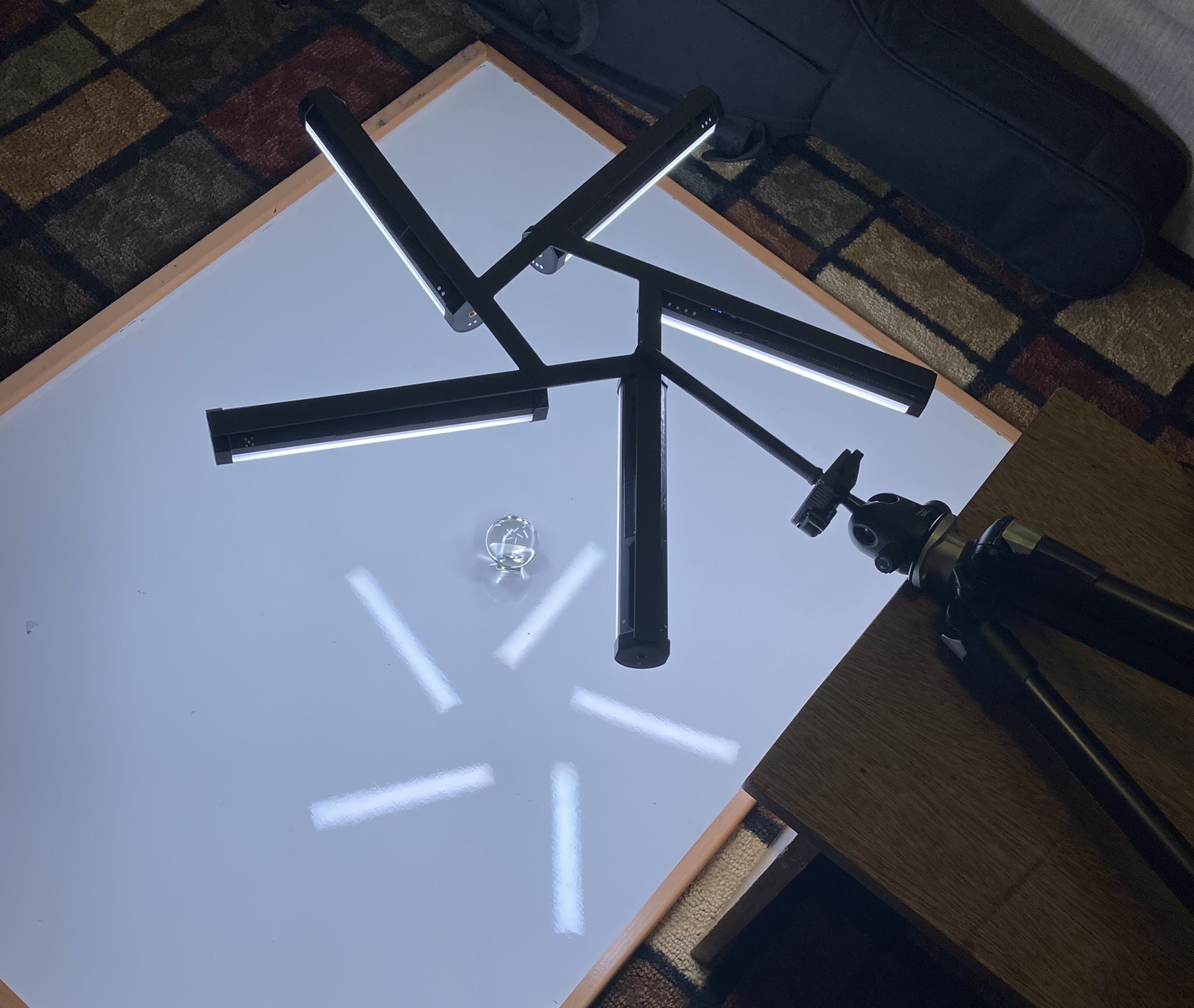
When I gave Tom the specs for the star pattern I specifically requested that he leave room for a hole in the middle large enough to poke my camera lens through, and while I don’t use this feature all that often it sure is nice to have. To get the final shot I used my Nikon D750 and 105mm macro lens, set to f/6.7, 1/250 second, ISO 400, and stood somewhat hunched over the entire setup with my camera stuck through the middle of the star. It was a little weird and felt a bit strange, but the result is an image that is pretty unique among my entire portfolio. It even looks like it’s shot in black and white, but that’s just because all the colors you see here are just white light and natural shadows. I think my favorite part isn’t necessarily the star pattern but the way the light bends and warps at the edge of the sphere, almost like the black hole in Interstellar. It was a really fun photo to set up and shoot, and it gives me a few ideas for something else to try 😉