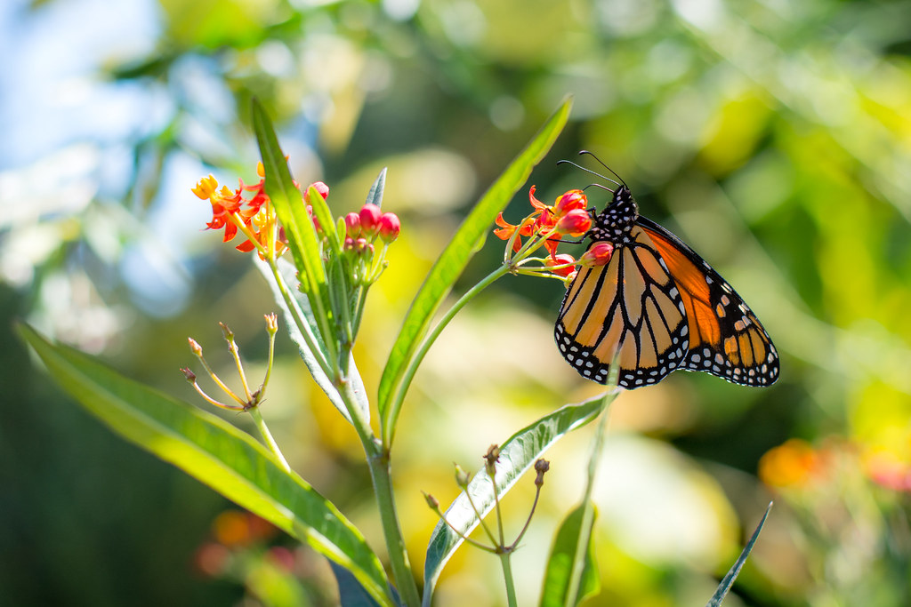
If you’re ever stuck for a photo opportunity, you could do a lot worse than your local botanic gardens. Almost every time my wife and I go there with our kids I’m struck at the incredible diversity of both flora and fauna tucked into the space of just a few acres, and sometimes it’s difficult not to snap a good picture. When we visited the gardens in October I brought my tried-and-true 50mm lens along with my D7100 and sure enough, I left with a memory card stuffed not only with some nice photos of my family but more than a couple displaying the beauty of nature. Case in point: the monarch butterfly you see above.
When I took this picture my parents were visiting for the weekend, and my dad and I spent several minutes basically crawling around next to some flowerbeds trying to capture pictures of butterflies as they were either flying, resting, or sipping flower nectar. My goal was to capture a photo with all of the following elements:
• A clear shot of a monarch butterfly
• On a flower
• With the sun behind me so it would be well-lit
This shot meets the first two requirements, but kind of misses the third. I like it though, because the shadows aren’t too dramatic and there is still plenty of color on the butterfly. The lighting also made for a more dynamic background, which I didn’t think about at the time but rather like in retrospect. The decision to post it here was a bit of a tricky one, because I also got this shot that I think is pretty decent:
I was really having a tough time deciding which of these two to use, but settled on the one you see at the top for a few reasons:
• There is a lot more going on besides the butterfly, while still retaining the butterfly as the focal point
• The background is more interesting
• There is a greater sense of motion and activity, whereas the second one feels stilted and rather static
• The lighting in the second image created harsh shadows along the ridges in the butterfly’s wings
I’m curious though…of these two shots, which one do you prefer and why? There’s no right or wrong answer, I’m just curious. But more than that, I’d also like to encourage you to look at some of your own pics and think about why you like certain ones. What about them stands out to you from a coloring, compositional, or even emotional standpoint? Learning why you like certain photos you take is a good way to help you to learn what works, what doesn’t work, and ultimately to take better photos as you grow as a photographer.
Chuck Murphy says
I prefer the second one. What really makes the butterfly stand out is the color contrast.
Simon says
That’s interesting, Chuck. I still prefer the first one but I do see what you’re saying about the color contrast.
Chris W. says
I go for the SECOND picture. When I looked at it, my eyes immediately locked onto the butter fly, whereas with the FIRST shot, my eyes initially went to the flower and then circled anti- clockwise to the butter fly. Also, the back ground of blue sky in #2 detracts less from the central ‘story’ of the shot.
Simon says
You make a good point about the blue sky detracting less from the central story of the shot, Chris. I hadn’t thought of it like that, though overall I still do like the first pic a bit more ;)
Gwain says
I like the first pic, but agree with Chris that the in the second photo the eye is drawn to the butterfly, but I find the sky, in background, overwhelms it a bit, maybe decrease the amount of “blue” and the butterfly would “pop” more.
I liked the colour balance in the first pic.
Both a great photos.
Simon says
Thank you so much for your comments, Gwain. I tend to agree with you that the first pic has a little better color balance overall, though as Chuck said there is more contrast in the second pic which helps the butterfly stand out a bit. It’s really interesting hearing different opinions on all this :)
Lisa says
Yes, we have the UNCC botanical gardens here where i live. I enjoy going there every time; endless photographic oppurtunities!
Simon says
Oh my goodness Lisa, I just did a search on Instagram for #unccgardens and it looks gorgeous! If I’m ever in the area I’ll make sure to stop by and hopefully get a few photos :)
https://www.instagram.com/explore/tags/unccgardens/
Tom says
I prefer pic #2. The bokeh is much better than pic #1. In pic #1 I find the background is a bit distracting and the butterfly doesn’t seem to be the focal point but rather to some degree the flowers. The shadows in #2 don’t bother me at all. It’s not that shadowey in general. I like how the vein- like markings on the wings really pop and are interesting to look at.
Simon says
This is fascinating reading different opinions about these two photos, and I appreciate your perspective Tom. I still prefer the first pic because it feels like the butterfly is part of a complete scene rather than standing out on its own, but I certainly see what you are saying about the second one. And really it’s not about which pic is better but which one people prefer, and I like that you and the rest of the commenters are just examining the pictures for what you personally find appealing. It speaks volumes about how all of us create and interpret photography and other works of art.
Susan Ringsmuth says
I prefer the first one because I enjoy seeing the background features. In fact I’d like to get a print of that one.
Simon says
Thanks Mom! And if you want a print we can get one made when we come up for Thanksgiving :)
Rebecca says
I prefer the top photo. I love the backlighting, it shows off the color of the Monarch so much better that the direct light. I also prefer the background. I look around the shot, but my eye goes right back to the butterfly. I tend to take photos with deeper exposure, so the top one appeals to me in that way, too.
The little bit of background in the second shot is just distracting, especially the second little guy lurking in the shadow. The light is too harsh. A diffuser may have helped.
Simon says
It’s cool finding out what people like (or don’t like) about each photo, and I honestly never even saw that second little guy down in the corner until you pointed it out Rebecca. I had no idea he was there at all, but now that you point it out it’s impossible to miss. I guess it goes to show you never know what people will see when they look at a picture :)
Tom says
Wow! Nice shot, Simon! Simon and John have fallen a long ways since I first met them riding Unicycle bikes all over Havelock! Now they are crawling around in the dirt, sniping at innocent butterflies with their cameras clicking at 50MPH!
What a father and son team! This picture says it was worth every second of the dirt eating it took to capture this!
Simon says
Oh dont’ worry Tom, we went back home and rode unicycles after taking pictures :) Now I need to think about how to get my own kids riding so they can maybe one day careen around the streets of Havelock just like their old man used to
Carolana says
OK, I have flipped back and forth between the two photos several times. Here is my two cents in this discussion: #1 there is more to look at and the colors are calming, however the spotlight seems to be on the flower, not the butterfly.
#2 is all about the butterfly and the lighting is sharper, thus the photo has more life and leaves the viewer wondering, “When will he fly away?”
If I were to hang it on my wall, I’d go with #1.
Simon says
Good analysis, Carolana. I like how you describe the first one with the focal point on the flower, not the butterfly. It kind of got me looking at it again and wondering about whether the flower and butterfly work together to create a single focal point, and if that’s something that I might be able to try more often. Hmm…
David says
Simon —
Nice picture of the Monarch butterfly. Initially, I was more attracted to your second photo. The butterfly was larger and more of the center of focus for the picture. However, ‘upon further review’ I think I prefer Photo #1. The background is out of focus just enough that is still lends contrast to the butterfly and flower while letting the viewer be able to generally tell what it is comprised of. There is great contrast in color between the background and the butterfly/flower in Photo #1. I know, I know there is contrast between the blue sky and the butterfly/flower in Photo #2, but that contrast is a simple blue sky and butterfly/flower vs. multicolored background and butterfly/flower. What this goes to show is that beauty is definitely in the eye of the beholder!!!! Give thanks to our God who created these marvelous things!
Simon says
You’re right about beauty being in the eye of the beholder, David! I tend to agree with your perspective too: the contrast in photo #2 is nice, but I think the first one has a more balanced approach even though there is a bit more going on in the scene.
Luke 12:27 comes to mind: “Consider the lilies how they grow: they toil not, they spin not; and yet I say unto you, that Solomon in all his glory was not arrayed like one of these.” As you said, God truly did create a marvelous world for us :)
Cindy says
I like them both but I’m partial to the blue background setting off the beautiful colors of the monarch.
Simon says
I certainly see what you mean about that, Cindy. If I’ve learned anything from the discussion on this post it’s that beauty certainly is subjective, and entirely in the eye of the beholder :)