• Skip to main content

Weekly Fifty

Exploring the wonders of creation through a 50mm lens...and other lenses too.

  • Subscribe
  • YouTube
  • About

Fossilized

June 14, 2023 4 Comments

DSC_8486.jpg

If this picture gives you a sense of Déjà vu, you might be on to something. Ever since I got my macro lens I have found myself revisiting pictures I shot years ago when I got a set of close-up filters—building on what I have learned, trying to take my photography farther, and adding to my own personal toolbox of photography techniques. This week’s picture is one of the first that I can recall that is designed to be a direct copy of an earlier composition, but better. And while I’m not entirely certain that I pulled off exactly what I was aiming for, I can say for certain that this shot shows evidence of learning and growth. And that, as you probably know, is what really matters to me.

For reference, here is my post from seven years ago with the original image of my pocket watch. I shot it with my 50mm lens and one or more close-up filters attached to the front, and all things considered it’s not a bad image. Not at all. It does pretty much about what I wanted it to do, which is show a close-up view of the watch face with hands set to roughly 10:10. Now that I have a true macro lens and a decent set of basic lights, I thought I could take a similar shot but do it much better, and with more intentionality, than the original. I think it worked, but again, the emphasis here is not on the final output but on the journey it took to get there. Hopefully if I revisit this same composition again years down the line the result will be improved even more.

When I took this shot I really wanted to pay attention to a few things that never even occurred to me on the original. First and foremost was lighting: I wanted to use my new Pavotubes to make the watch really shine in a way that the first picture lacked. First I tried making the composition using wild colors of light like purple, orange, red, etc. The results were bad. Really bad. Instead of causing the watch to shine, it just looked dingy and weird. Or maybe post-futuristic, like something out of Blade Runner. Either way, it was not, as they say in The Mandalorian, the way. I had to find a better option.

Then I realized that the Pavotubes have a pretty nifty option which I had heretofore entirely overlooked: you can set a custom white balance. Rather than experimenting with colors, I set the value of all three Pavotubes to basic white light with a temperature of 2700K. That transformed the shooting process entirely. I found myself going to a mental state where I was using the lights to highlight and accentuate the color of the watch rather than using lights to change or otherwise alter the color, as I had previously done with so many similar images.

My task, then, became an exploration of how to use the lights to best showcase the watch. I ended up with the setup that you can see below:

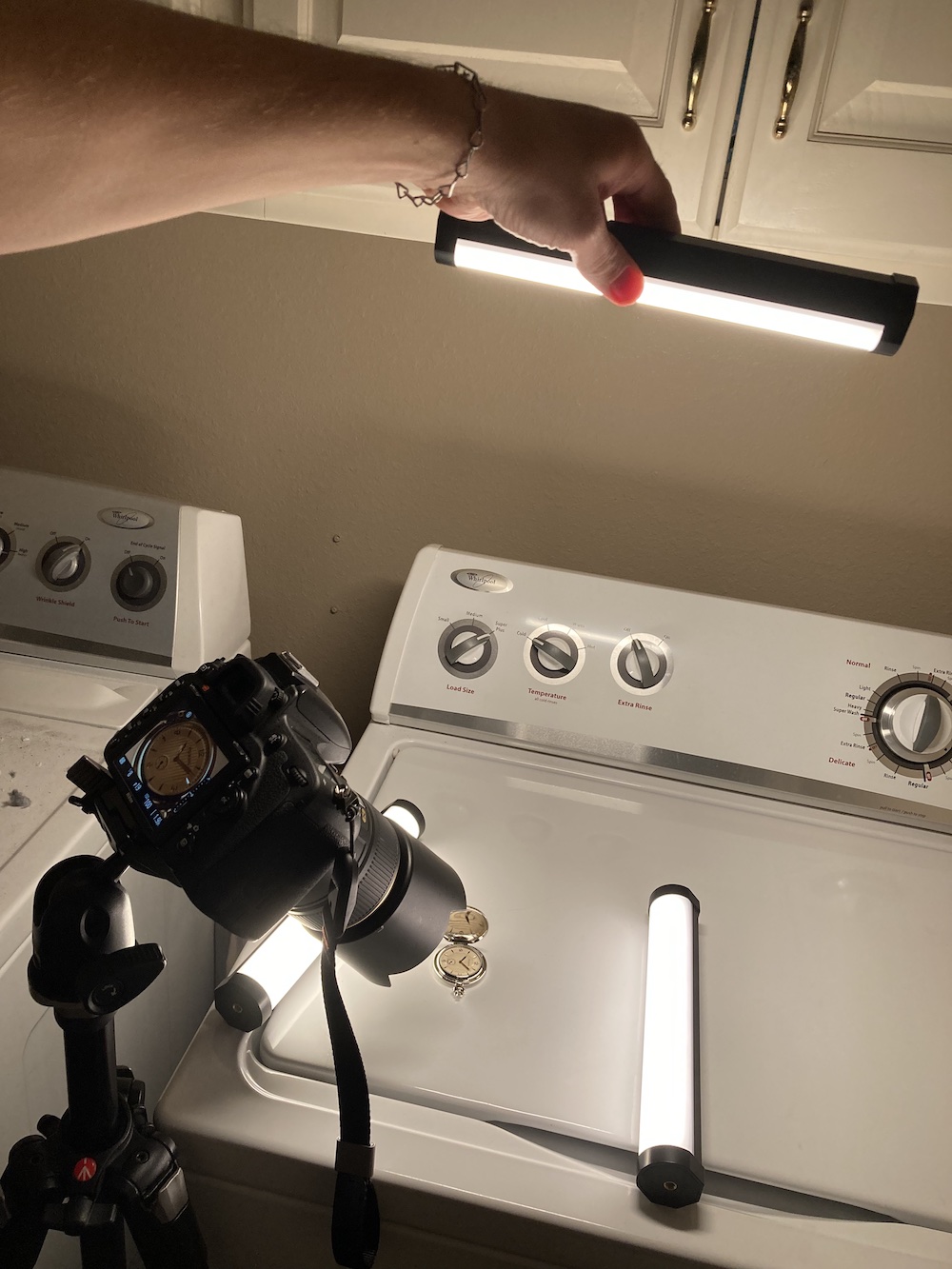
Each of the three lights was placed intentionally: the two on the sides created a rich glow on the outer bezel of the watch, and the light I am holding up with my hand made the face glow while also adding a spark to the tick marks at 1 and 7. It took a ton of experimentation to get the lighting just right, and I really just ended up taking dozens of shots until I found one that just worked. Editing was super simple too: I set the white balance of the RAW file in Lightroom to 2700K to match the lighting precisely, and all I did after that was use the Heal took to remove some spots and other imperfections.

Yeah, these lights are awesome :)

Read my educational photography articles at Digital Photography School

This Week in Photo Interview

June 9, 2023 2 Comments

I was recently interviewed by Frederick Van Johnson for This Week in Photo, and since our conversation was entirely focused on Weekly Fifty I wanted to share it with all of you here on the blog. You can read more (or listen to the audio podcast version of the interview) by visiting This Week in Photo, and I’d love to hear any thoughts or comments you might have.

Thank you!

Simon

Read my educational photography articles at Digital Photography School

Square x Circle

June 7, 2023 Leave a Comment

DSC_8418.jpg

If you have been following Weekly Fifty recently, you have probably seen some shots I have taken with my new color-changing LED lights. Today’s picture, then, will probably not surprise you as yet another in this series as I learn to use this new style of lighting in my photography. However, this shot contains a few key differences from the ones I have shared in previous weeks. First of all, even though I took all the pictures thus far with my 105mm macro lens this is the first one that is a true macro shot. Second, the subject here is almost entirely monochromatic: hard white plastic, rubberized black accents, and only the faintest bit of color with the button icons which are a shade of light bluish-purple. That means the coloring is coming not from the subject, but from the lights, which is something I’d like to explore more in the coming weeks and months.

I employed a rather unusual setup to take this picture, which presented some interesting challenges that were fun to attempt to overcome. First of all, I had a concept in mind for this picture which helped a great deal when I set out to actually take it. I knew I wanted a top-down view of the buttons on the controller, and I knew that I wanted a shallow depth of field as well. That meant I had to shoot with my camera pointed straight down, which meant I needed to use a tripod and angle my camera down. Fortunately my trusty Manfrotto tripod I have had for nearly 15 years did the trick quite nicely, but then I also had to use some boxes and even my wallet to bring the controller close enough to the lens, and positioned at just the right angle, for this shot.

After that I had to play around with the lighting. A lot. I tried different colors and different positions of the lights, including far away and close up as well as holding them in the air with my hands. I took several dozen shots but this one ended up as my favorite for a few reasons. First, the bright glow on the right side of the frame felt like just the right amount: not too much, but not too little. I also liked how there were little spots of orange light on the left side of the buttons that were created from the same light source. I am also really happy with the depth of field: the X is tack sharp while the rest fades away, which gives a sense of three-dimensional depth to the shot. Finally, the white plastic being cast in a soft purple thanks to the other light tube ended up working out really well too.

I also shot this at ISO 100 to get a nice clean image, but then realized afterwards just how dirty the controller was. I had to clean up a lot of dust and other minute imperfections in Lightroom, but that’s kind of par for the course with close-up shots like this. In the end this is probably my favorite shot I have taken yet, and only makes me more excited for what else I can do with these lights :)

Read my educational photography articles at Digital Photography School

Mini Blue

May 31, 2023 Leave a Comment

DSC_8394.jpg

Much like the pictures I have shared the past two weeks, there’s a story to tell here and one that I feel is enhanced by the lighting choice. And once again, this image comes to you courtesy of my new Nanlite Pavotubes which I am thoroughly enjoying and continue to find new ways to use, along with my 105mm macro lens which, though perhaps unnecessary for this particular shot, did come in handy because of its excellent optical qualities and the fact that I did not have to think about how close or far to get from the subject. With a macro lens, nearly any distance will work which is a huge benefit when you want maximum photographic flexibility.

I bought this iPod Nano for my wife back in 2004 shortly before we both graduated from college. She enjoyed listening to music and I thought this would be a fun surprise for her, so not long after Steve Jobs introduced it on stage I cashed in my big jar of spare change and bought one for her. She used it for a few years until it suffered the same fate as so many of its peers: the tiny internal spinning hard drive simply ceased to function. Now it adorns my bookshelf at work, where I can show it to colleagues and visitors and think about how much technology has changed over the years.

Enter the Nanlite Pavotubes :)

I figured this iPod mini would be an ideal candidate for a fun experiment with off-camera colored lights, and looking at the results I think I was right. I used a blue light to accentuate the metallic blue color of the device itself, and placed the light carefully so as to create a bit of a reflection on the small black-and-white screen. then used an orange light to add some color to the left side of the subject, and deliberately positioned that light to cast a shadow off to the top-right. In fact, it was this picture when I really started to think carefully about the shadows and not just the light. I adjusted all three elements of the shot (subject, lighting, and angle) to create the dual shadows you see here, while once again using the surface of our washing machine as a pretty cool way to add some shine and reflection to the image.

This turned out to be a super fun photo to take, and has once again shown me just how much there is to explore with these lights. I can’t wait for what’s next.

Read my educational photography articles at Digital Photography School

Sprinting

May 24, 2023 Leave a Comment

DSC_8210.jpg

I’m not the kind of person who hangs on to a lot of physical objects. Digital clutter is fine, because it’s easily searchable and doesn’t take up much space in my house, but physical clutter is another thing entirely. It’s not that I throw away everything from earlier in my life, but I (along with my wife) try to be selective about what we choose to keep around and what to toss. This old cell phone is, for some odd reason, one of those things that has been sitting in various drawers, boxes, and bins over the years but, much like Bob Wiley, has never actually left. It doesn’t charge and wouldn’t work if it did, since the cellular network it used has long since been shut down, but it’s still a fun relic to keep around and show my kids.

I’m getting a bit ahead of myself here; a bit of context is probably needed in order to better understand this week’s picture.

The cell phone you’re looking at is the first cell phone I ever got. I think I received it as a Christmas gift in maybe 1999 or 2000, as an upgrade to the pager I used to wear around my belt loop. (A pager! Man, kids today will never know…) It couldn’t do much other than make calls and the battery died if the conversation lasted more than 20 minutes, but the flip-out antenna was super cool and it was small enough to fit in my pocket–a big deal for phones back in those days. This phone now sits on my office shelf at work, a reminder of my digital roots, so to speak, and though it serves no practical purpose I do think it’s fun to pick up and show people.

So when I got my Nanlite Pavotubes I naturally thought this old phone would be a fun photography subject. And while I don’t think I was wrong, I will say that there are some definite areas of improvement here. As I have said time and time again, photography for me is all about the learning process and I can most certainly see that process at work in this photo.

For starters, the black phone appears to have a kind of blue/cyan tint to it, which is a direct result of the color of light I was using on the right-hand side of the composition. Whereas last week’s shot of a Super Nintendo controller used light and shadow to accentuate the buttons and contours, the blue light here doesn’t really do much other than to cast a visible pall over the phone. It’s not great, and I think a more neutral light would have worked better. I also used a yellow light behind the phone to add some highlights but again, it seemed better in theory than in practice.

If last week’s shot was me gleefully exploring the possibilities of colored off-camera lighting, this week’s picture is a reminder that I also need to reign it in a bit: plan my shots, consider my subject, think about what the purpose of the lighting is…but also experiment and have fun because it’s all part of the learning process :)

Read my educational photography articles at Digital Photography School

  • « Go to Previous Page
  • Page 1
  • Interim pages omitted …
  • Page 29
  • Page 30
  • Page 31
  • Page 32
  • Page 33
  • Interim pages omitted …
  • Page 141
  • Go to Next Page »

Copyright © 2026 Creative Commons License
This work is licensed under a Creative Commons Attribution-NonCommercial-NoDerivs 3.0 Unported License.