• Skip to main content

Weekly Fifty

Exploring the wonders of creation through a 50mm lens...and other lenses too.

  • Subscribe
  • YouTube
  • About

Firestarter

July 8, 2015 12 Comments

Firestarterhttps://www.weeklyfifty.com/wp-content/uploads/2015/07/WeeklyFiftyPodcast2015July8Firestarter.mp3

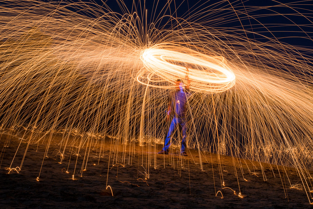
This is a shot I have had in mind for a long time, and was able to finally get it thanks to some help from my brothers Phil and Tom on our recent family vacation. It’s a particular style known as Steel Wool Photography and ever since I saw a few examples several months ago I have wanted to give it a try. When we headed up to our annual trip to Milford Lake in central Kansas we went to the beach and spent about a half hour playing around with different compositions until we found a few that we liked. The basic idea here is pretty simple, but takes a bit of planning to pull off along with the following sundry items:

Kitchen whisk from the dollar store
Two feet of chain
Connector to hook chain to whisk
00-grade Steel Wool from any hardware store
Cigarette lighter

All the above items can be bought for less than $10, and after that you just need a dark night and some open space to play around. The spark trails come from the steel wool itself: light it on fire and it will start to glow, and then spin the contraption around to create sparks that fly out in all directions. We took several initial shots that ended up looking like glowing circles or giant spark-flinging springs hovering on the beach (you can look at a few examples on my Flickr page), but eventually we came up with the idea of having Tom stand in one place and spinning the whisk around above his head.

To get this particular shot I had Tom stand about 30 feet away and hold very still while swinging the smoldering steel wool above his head. I set my D7100 + 50mm lens combination on a tripod and used an exposure of 30 seconds at f/13, ISO 200. This was the fifth or sixth photo we took during our experimentation session, and I was quite pleased with how it turned out. You’ll notice a strange glowing effect on Tom’s face if you look closely, which came about by way of me running up to Tom after I clicked the 30-second shutter and shining a dim flashlight on various parts of his body. The small glow in the center of his chest was from when he initially lit the steel wool with the lighter, which kind of looks like some kind of video game effect. My idea was to make it appear as though Tom was standing perfectly still along with a spiral of sparks and flames above him, but the finished picture looks a bit off because, let’s face it, it’s hard to stand perfectly still for 30 seconds while twirling a red-hot spark-throwing kitchen utensil a foot from your face. Part of me thinks this is what a Final Fantasy summon spell would look like in real life too :)

I was really excited to get the opportunity to try a few shots like this, and look forward to doing it again and refining what I learned on this initial trial run. Many thanks to Tom for doing the gruntwork and and Phil who helped coordinate everything while also taking some cool shots with his D3200 + 35mm lens. Also thanks to Prodigy for giving me the idea for this picture’s title.
Read my educational photography articles at Digital Photography School

Flower Sunrise

July 1, 2015 15 Comments

Flower Sunrisehttps://www.weeklyfifty.com/wp-content/uploads/2015/07/WeeklyFiftyPodcast2015Jly1FlowerSunrise.mp3

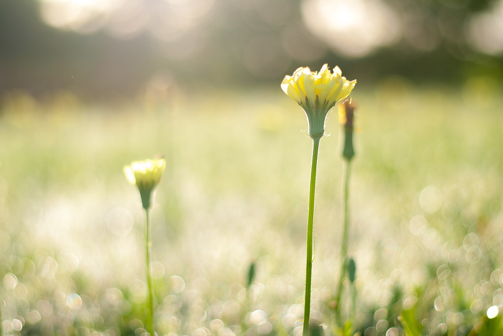
Another one in the never-ending series of pictures that fall under the category of “Shots I almost didn’t get because I was too lazy,” this is kind of a simple picture of a flower at sunrise but there’s a few things that stand out to me not only about the photo but about how it was shot, so I figured it was fairly well suited to end up here on the blog. We have had an unusual amount of rain in Oklahoma this year, with May being the wettest month ever since records have been kept. So much precipitation, in fact, that sunny mornings like this have been more the exception than the rule. This has led to an incredible amount of greenery and other natural growth that doesn’t usually happen until a bit later in the year, if at all, and is part of what made this shot possible in the first place.

As I was driving to work (instead of biking, thanks to the wet weather) I saw this field near our house that had exploded in yellow flowers overnight. My first thought was “Hmm, that would make a good picture” and then I just kept driving. Seriously, I almost didn’t get this picture because I decided I couldn’t spare 30 seconds to stop my car and walk across the street. Thankfully I quickly realized that this was a pretty lame course of action especially given how often I preach about getting your camera off the shelf and going out to shoot with it. A half block later I pulled into a parking lot, grabbed my camera, and ran back to the field to take a few pictures because…well, why not?

I liked how the sun was peeking over the horizon which not only gave a nice bit of backlighting on the flowers, but also gave the rain and dew on the ground an ethereal, almost otherworldly look. (Truth be told it reminds me of some areas deep within the planet Zebes.) I purposely left the image a bit low in overall contrast to give it a somewhat dreamy quality, as if you were looking at it soon after waking up before your vision has cleared. As is my custom I did not review the shots on-site, and instead just got in my car and continued on my drive to work hoping I got a good picture. Turns out I did, or at least I got one that I’m happy with. And really, that’s often all that matters with photography anyway :)

Read my educational photography articles at Digital Photography School

Fountain Stroll

June 24, 2015 7 Comments

Fountain Strollhttps://www.weeklyfifty.com/wp-content/uploads/2015/06/WeeklyFiftyPodcast2015June24FountainStroll.mp3

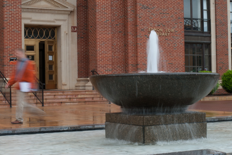
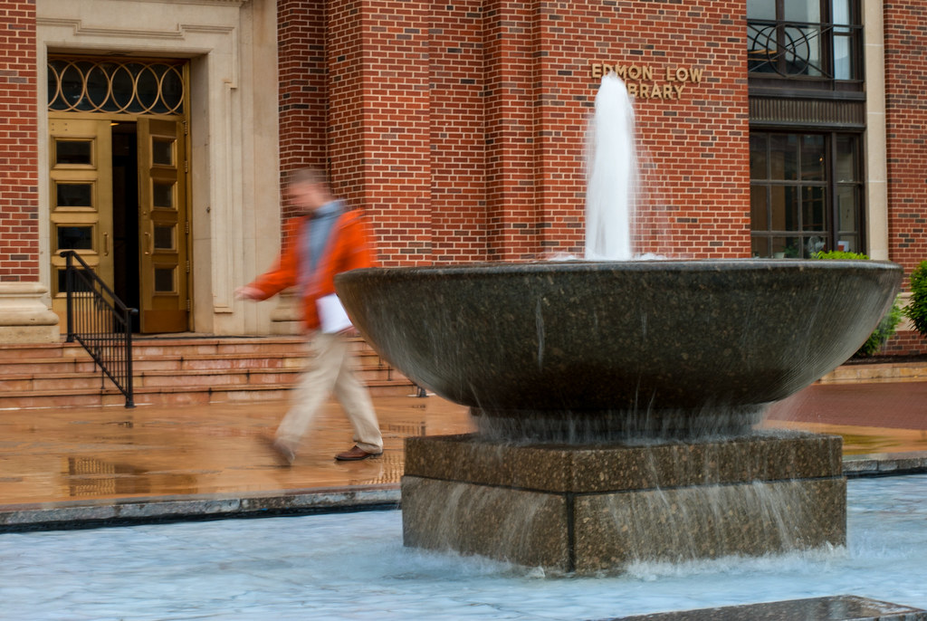
I’ve said before on this blog that I’m not a big fan of excessive photoshop manipulation, but this image is certainly a notable exception. First, a bit of background: this fountain sits just in front of the main library on campus, and for a while now I’ve wanted to get a shot just like the one you see here with the water streaming while a passer-by strolled behind it. Shooting this with a 50mm lens presents some problems, the first of which is light or, rather, the overabundance of it. Without a neutral density filter to block out some of the incoming light, shooting at a slow enough shutter speed to get motion blur requires a super low ISO and super small aperture. On a bright sunny day an aperture of f/16 (the smallest aperture my 50mm lens will shoot at) and ISO 100 requires a relatively fast shutter of 1/30 or 1/60 which is far too quick to get the motion blur I was looking for. Another problem is that of proximity: a shot like this requires the photographer to be somewhat close to the fountain since prime lenses don’t zoom. And finally there was the human element, which was quite out of my control since I had to wait for someone to casually stroll by.

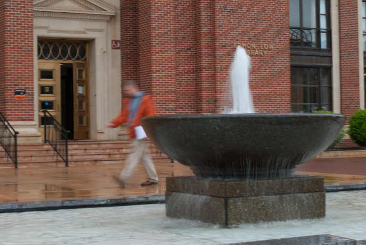
On a recent rainy day all these elements came together: the light was dim so I could shoot at a slower shutter speed, I was able to stand on an edge of the pool at the base of the fountain to get close, and there were enough people strolling around for me to get a shot of one of them walking past. This left another problem though: I shot this handheld at 1/8 second, which meant it was very difficult to get a clear picture without any background motion blur. The only blurry elements I was wanting were the person and the fountain, and at 1/8 second even the smallest movement of my camera would result in a noticeable blur in the brick background. My solution to this was to shoot in continuous high-speed mode which is about 5fps on my D200, hoping that I’d at least get one shot that was clear. Turns out I did, but it wasn’t the shot I was hoping for. This, then, led to a bit of photoshop trickery. For reference, here’s the original picture as it was shot:

stroll-clear

Everything is nice and clear, but there’s one big problem: the pedestrian is way too far to the left. Thankfully I did get this shot a fraction of a second earlier:

stroll-original

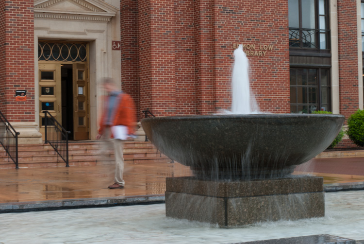
Bingo! The guy is precisely where I wanted, but the photo is all blurry thanks to my shaking camera. I used Photoshop to cut and paste the walker from this image into the first one, but then I also had to remove him from the left-hand side of the original as well. As luck would have it, there was a third (mostly) clear picture I could use for filling in the left-hand side:

stroll-clear-left

The final image, then, is a composite of all three and since I was already doing plenty of Photoshop alterations I went all in and removed the signs and icons from the library doors. I figured if I had already committed to altering my picture, I would go ahead and make Lando Calrissian’s worth nightmares come true and alter it even further.

This raises some serious questions that every photographer must grapple with, and have been trying to answer for decades even before Ansel Adams was dodging and burning landscapes in his darkroom: how much image manipulation is too much? When does a picture cease to represent reality and become merely an interpretation of reality? What responsibility does a photographer have when presenting his or her images to the world? What about the use of filters or color alterations such as Sepia or Black and White? There are no good answers of course, and every photographer is going to have a different stance on the matter. But if I could leave you with one piece of advice it would be this: be able to justify whatever editing decisions you make, whether to yourself or to someone else. Make your edits intentionally and for a purpose, and if nothing else you will sleep a bit easier at night knowing you at least had a reason for what you did :)

Read my educational photography articles at Digital Photography School

Bygones

June 17, 2015 8 Comments

Bygoneshttps://www.weeklyfifty.com/wp-content/uploads/2015/06/WeeklyFiftyPodcast2015June17Bygones.mp3

This is a photo I’ve been trying to capture for a while, but never quite found the right look that I was hoping for. The basic idea behind this picture is to capture a subject via its reflection in a puddle–a simple-sounding task that ended up being a bit more complicated than I thought. Not in this particular photo, but just the overall concept proved trickier than it seemed at first. It’s not difficult to find puddles on rainy days, but I had a couple things in mind for the photo I was trying to get:

• The subject’s reflection had to be clearly visible in the puddle
• The puddle could not have any raindrops or other natural elements to otherwise obfuscate the subject
• There had to be enough good lighting to accentuate the subject
• I wanted a few things to be visible in the puddle as well such as sticks, leaves, grass, etc.
• Ideally the subject would be a person, preferably an unexpecting pedestrian or passer-by

Almost every time it has rained in recent months I have kept my eye out for these various elements when passing puddles, but while one or two were usually easy to see I soon discovered that to get everything to happen at once was a bit of a long shot. When I saw this puddle after a recent bout of rain I thought I had hit the jackpot, except for the final element: with no humans wandering by, I was forced to make do with one of the buildings on campus (the same building from this photo I posted about a year ago). The reflection was giving my autofocus a bit of trouble so I used manual focus instead, and shot at f/2.8 to get a shallow depth of field though in retrospect I think that was a bit too wide. F/3.3 or f/4 would probably have been a bit better since they would have shown the yellow leaves a bit more clearly, but overall I’m happy with how it turned out.

Incidentally, I titled it “Bygones” because the photo was taken on the final day of OSU’s 2014-2015 school year. I thought the idea of a reflection picture was an appropriate way to commemorate the occasion.

Read my educational photography articles at Digital Photography School

Droplet

June 11, 2015 2 Comments

Droplethttps://www.weeklyfifty.com/wp-content/uploads/2015/06/WeeklyFiftyPodcast2015June10Droplet.mp3

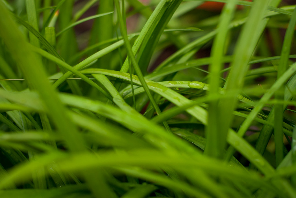
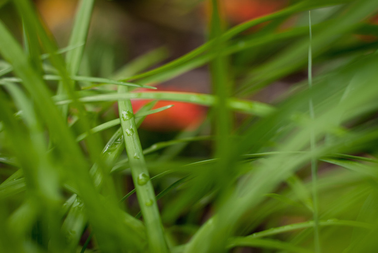
I realize this picture is quite similar to one I posted a long time ago, but I’m using it for this week’s image specifically to make a point about my thought process when deciding which pictures to upload to my online Flickr portfolio and then feature here on Weekly Fifty (not all of which make the cut). It’s sort of a case study analysis, so to speak, partially to illustrate how my approach to photography has changed over the years but also to help others who might be wondering how to change their approach to photography too.

What you see above is relatively simple: a drop of water in a patch of grass. There’s a very monochromatic black-and-green color palette and not a lot of things going on, but I want you to compare it to a similar picture I took in the same location a few minutes later:

DSC_2683-750

The two images are remarkably similar, and the second one was originally going to be the subject of this week’s blog post. But after a little thought and analysis I settled on the first one and I thought I’d take a minute to explain why.

One of the things I like to keep in mind when photographing is the question “What do I want the viewer to see/think/feel?” In this case I was not trying to impart any special message or feeling, but rather have the viewer notice a simple drop of water on a blade of grass. Even though both images do that, the second one has a bit too much going on and actually becomes a bit of a mess. The focal point of the second image is the drop on the top of the blade of grass, and once you see that you might notice other things as well: additional drops of water, the surrounding blades of grass, or the (blurry) red flower in the background. This was good, I thought, because it gave the image more depth: it’s actually a lot more than water on grass, and that’s a good thing.

Right?

Not really. The more I looked at the picture the more I realized there was actually no focal point and instead there was a confusing mess. What was it I was trying to get my viewers to see? Was it a single drop of water, or many drops of water? The red blob in the background became distracting, and the foreground elements (some of which are on the left, some on the right) divided the viewer’s attention. Instead of being about one clear thing the photo was about many unclear things.

Even though the picture on top had less color and less going on it was actually far more pleasing to the eye and, in my view, more interesting overall. There is one clear focal point: the single drop of water. That gives the viewer something much more concrete and tangible on which to focus his or her attention, and a more pleasing sense of place and context as well. The foreground is not as cluttered and there is nothing in the background to divert the viewer’s attention. It’s simpler but, in my opinion, a much better image.

Read my educational photography articles at Digital Photography School

  • « Go to Previous Page
  • Page 1
  • Interim pages omitted …
  • Page 120
  • Page 121
  • Page 122
  • Page 123
  • Page 124
  • Interim pages omitted …
  • Page 146
  • Go to Next Page »

Copyright © 2026 Creative Commons License
This work is licensed under a Creative Commons Attribution-NonCommercial-NoDerivs 3.0 Unported License.