This is one of those shots that I had in mind, or at least had a clear vision in my mind of what I wanted to do, and while the end result is pretty good I’m not entirely certain I accomplished what I was going for. It’s not bad, not by a long shot, but I can’t shake the feeling that there’s more I could have done here. No worries though! It just means I get to experiment more and continue to learn about photography and lighting :)
So the idea for this shot came to me when I saw the little yellow Shy Guy that my son brought home from school a while ago. The expression on his face, and the position of his arms (the figuring, that is. Not my son) made me think that he was about to embark on some grand adventure, or perhaps more like Bilbo Baggins beholding Smaug atop the pile of treasure beneath Erebor. I knew I wanted to have more in the shot than just this little yellow dude…but what? What could I add that would create the mood I was going for? The answer, once again, came from my kids.
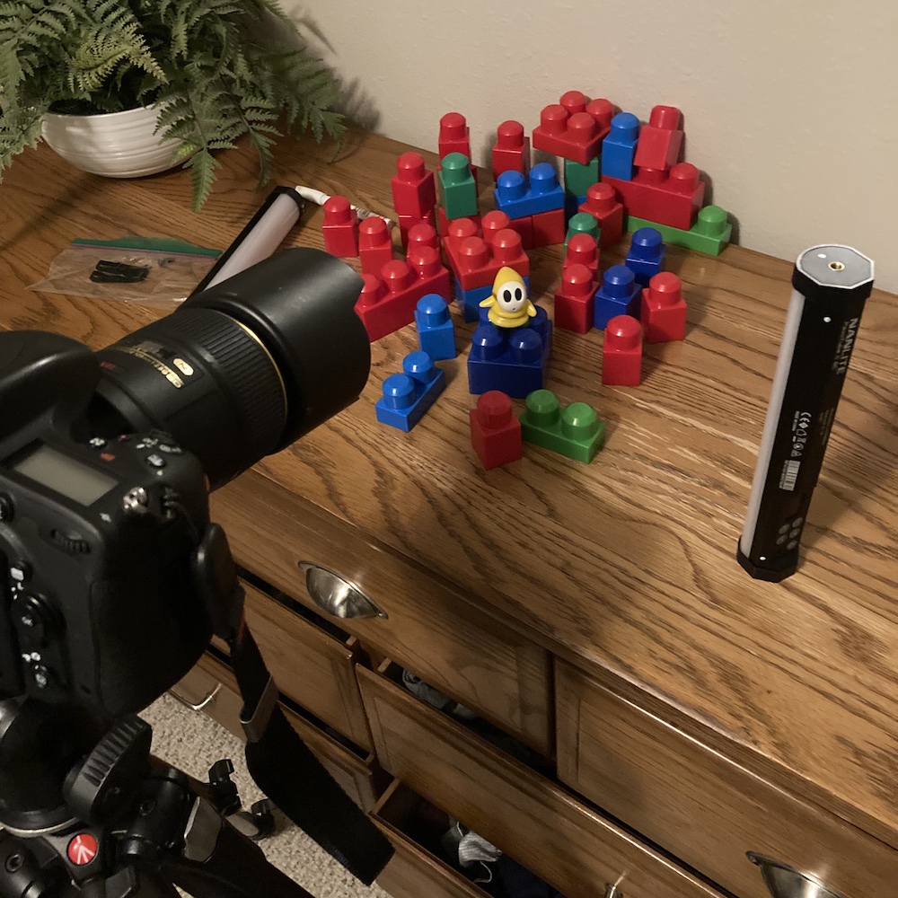
Even though our two boys have long since stopped playing with the large blocks you see in the behind-the-scenes picture above, we still have hundreds of them stashed away for when their younger relatives come to visit. I thought they could be used to create an interesting context for this little yellow dude’s journey, and I also wanted to make specific use of the colors you see here as well. Since the subject was entirely white and yellow, I eliminated all similar colors from the blocks I used to create the composition. The result was a palette of red and blue, with a few green accents, which served to showcase the Shy Guy and draw your attention straight to his face and eyes.
The final piece of this photographic puzzle was the light: where to put it? What color to use? How bright should it be? How many lights to use? The list went on. In the end I opted for a super simple solution: one single light, placed vertically on the dresser just like you can see above. I tried using two lights with one in my left hand held above, but ended up preferring the single-light pics because of the sheer sense of mystery and foreboding it lent to the entire scene. Something imposing is just off to the right but, much like Marcellus Wallace’s briefcase, we don’t actually know what it is. The little yellow dude sure does though, and is choosing to face it with a mix of fear and courage.
It’s all just a couple pieces of plastic and one light, but the result is pretty cool. And a concept I’d like to revisit as well, to see if I can get a final result that’s even closer to what I’m imagining in my mind.